• Skip to primary navigation
  • Skip to main content
  • Skip to primary sidebar
  • Skip to footer

This Second's Obsession

  • About Me
  • Archives
  • Courses
  • Newsletter
  • Navigation Menu: Social Icons

    • Facebook
    • Instagram
    • Pinterest
    • Twitter
    • Vimeo
    • YouTube
You are here: Home / Archives for Julianne

Julianne

Purple Make-up and Me: A History

March 4, 2013 By Julianne

When I saw this month’s topic for Sophistique Noir’s monthly theme post meme, I knew I had to participate. I am the Queen of Purple. How could I resist such a fine opportunity to spread the word of the most important, vital, and beautiful of colours?

It’s a strange fact, but I have been interested in make-up for longer than I have loved purple. I’ve mentioned this before, but there was a time when I thought yellow was the god of all colours. Misguided youth! But even then I was fascinated with make-up. I wasn’t a girly girl, I almost always wore jeans and t-shirts, but I loved painting my nails with pink peel-off Barbie nail polish and although I had no idea how to wear eyeshadow I liked to look at the purple powder sitting in my (also purple) Polly Pocket make-up box.

In my teens, with my pocket money burning a (very small) hole in my pocket, I often went ‘shopping’ on Saturdays with my best friend. I rarely bought any clothes because they were too expensive but it wasn’t often that I left without buying an eyeshadow or a nail varnish. And so, I bring you:

A Short History of a Love of Purple and a Make-up Addiction
starring: my favourites from over the years
featuring: many discontinued products, I’m afraid, but hopefully you will still enjoy it!

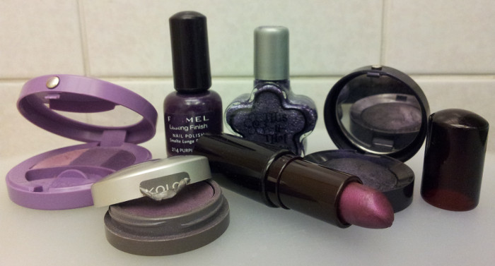
Once upon a time there was a teenage girl. And that teenage girl loved a) make-up and b) anything that could be interpreted as a “bargain”. That teenage girl is the reason why I have this 10+ year old purple lipstick (Rimmel High Frost in ‘Cassis’) here today. I only wear it occasionally. And only over pink or red lipstick. Hence its longevity.

That teenage girl also had friends and relatives who bought her nail varnish as gifts. The Rimmel Lasting Finish in ‘Purple Rain’ was a present I still love to wear today, though it needs a lot of thinner added to keep it smooth! I actually have two bottles, because my sister also got one as a gift at some point and later decided she didn’t want it. The This n That Slick This Nail Polish in ‘Nuts About You’ (no idea what the name has to do with the colour) was another gift and is my favourite to apply over the top of clipped nail varnish because it has silver flecks and hides my laziness wonderfully. I bought another very similar polish from the Caboodles brand as a backup when it was on clearance in Superdrug.

Speaking of Superdrug, the eyeshadow closest to the front of the photo is from their former own brand line Kolor. I have quite a few of the nail varnishes and the quality is fantastic and they’ve lasted really well. The eyeshadows were not as reliable – I’ve got a silver and magenta-purple duo that I love but another couple that are rubbish. This is a Kolor Eyeshadow in ‘Dusk’. The packaging describes it as a ‘Lasting crease-resistant eye colour’, but it only really works packed heavily onto a cream base. That didn’t stop me wearing it in my teens without any base or primer and wondering why it disappeared so quickly. Oh, the days before Urban Decay Primer Potion. That said, even Urban Decay’s own purple eyeshadows can be a bit hit and miss – I think it’s just the nature of purple pigments.

The Bourjois eyeshadows are much better but still a little iffy – I used to use the Effet Lumiere Trio in ‘Violet Imperial 49’ regularly and have recently discovered that it actually lasts and shows up if I use a white pencil as a base. I haven’t used the single eyeshadow in ’04 Noir Precieux’ for a long time – in my late teens I used spread it thinly (and nearly invisibly) all over my lids and then press it on top of my liquid eyeliner to hide the wonkiness. It looks really pretty in the pan – smoky violet shimmer – but I’ve yet to work out a way to get it to look as good in action.

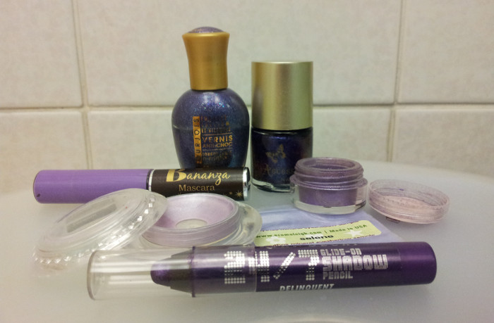
Here are some more recent, and better quality discoveries. The Bourjois Very Vernis in ? is Cadbury purple, with multicoloured glitter, and the Accessorize ‘Purple Dream’ varnish is my favourite nail varnish ever, a purple-based duochrome that shines pink or turquoise depending on how you tilt it to the light. Two Aromaleigh eyeshadows feature: ‘Almost Midnight’, which I have loved for a couple of years now, and the more recent discovery, ‘Selene’, an incredibly sparkly lavender shade.

The Urban Decay 24/7 Glide-On Shadow Pencil in ‘Delinquent’ is fantastic alone but is even better as a base for ‘Omen’ eyeshadow. B Never Too Busy To Be Beautiful’s ‘Bananza’ is the best coloured mascara I have ever tried – it shows up really well.

But my most loved item of all is the cream shadow, which is another really old product. It’s a Superdrug Secret Weapon Cream Eyeshadow in ‘003’, and it is AMAZING. Not as a cream eyeshadow, it’s pants at that, barely shows up and creases, but as a base for loose powder it is the best thing I have ever tried. Over UDPP it doesn’t crease and my Aromaleigh shadows stay perfect all day. I prefer it to Pixie Epoxy because I find that PE gobbles up some of the shine, whereas this keeps everything shimmery and lovely. This wasn’t originally mine – my sister had a clearout a few years back and I picked it up out of interest, but only tried it when I was trying to find something I could use as a base for loose powders. If I could go back in time to Superdrug and stock up on one thing, it would be this, for as you can see I hit pan some time last year and there is a lot left, but one day I will run out of it!

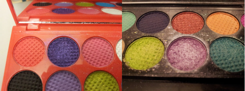
Here we have my two favourite purple eyeshadows from Sleek i-Divine palettes, which have both gotten a lot of use over the past couple of years. The unnamed purple shimmer from the Circus palette, and ‘Lotus Flower’ from the Monaco one. As you can see these get more use than any of the other shadows, with the exception of ‘Bamboo’ in the Monaco palette which is a matt beige shade that is almost the same colour as my skin and therefore makes a great highlight.

My current favourite purple eyeshadows, however, are by Urban Decay, the kings of purple eyeshadow, in my opinion. The least fantastic of the three is ‘Flash’, or ‘Underland’ as it is named in the Alice in Wonderland palette. It would be the perfect vibrant bolt of purple if it wasn’t for the fact that it fades away to nearly nothing unless I really, really pack it on. I love the colour but it requires a lot of work and is completely unreliable.

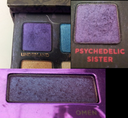
‘Omen’ from the 12th Anniversary Palette is my second favourite – it needs a good white base to show up properly but it’s almost got a blue duochrome and it lasts well. But my absolute favourite is ‘Psychedelic Sister’ – applies like a dream, beautifully pigmented, and no base required. I’m sure I’ll be loving it for years to come, even when I discover even more lovely purple products.

Do you wear purple make-up? What are your favourite products? How long have you worn them?

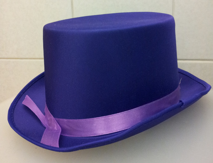
PS. My boyfriend got me a purple top hat for my birthday. Couldn’t resist showing it off, especially as it fits the theme!

Filed Under: Makeup and Skincare Tagged With: cosmetics, favourites, make-up, purple, purple (love of), PURPLE PURPLE PURPLE, Superdrug

Valentino: Master of Couture, at Somerset House

February 22, 2013 By Julianne

Valentino: Master of Couture is a temporary exhibition at London’s Somerset House, celebrating the career of Valentino and including 137 haute couture designs in its impressive main display.

After paying for your ticket and collecting your accompanying booklet, you proceed into a room containing a giant lightbox, onto which is projected some pictures and a quote either about or from Valentino. I have forgotten which. It looks good, and I certainly felt impressed when I entered the exhibition, but the size of the introductory room felt excessive compared to the rest of the exhibition.

Walking through the doorway to the second room, the first thing I noticed was the giant rose on the opposite wall, and the timelines on the two adjacent walls, which show important points in Valentino’s career. Below these, around three edges of the room, are cabinets that look as if they have chairs behind them, like desks. The first cabinet I looked at contained original sketches by Valentino. I don’t know if any of the outfits in the sketches were on display in the catwalk, because I don’t have a photographic memory. If so, I think they would have had more value if they were presented beside the dresses, but there is nothing to stop you leaving the catwalk and going downstairs to look in the cabinets again, if you chose to do so.

The second cabinet contained photos of solo models and celebrities, some wearing Valentino, some posing with the man himself. I wasn’t sure what the point of the photos of celebrities with Valentino was, and would have liked to see more photos of the outfits from the exhibition being worn. The third cabinet contained a mixture of letters, faxes, and telegrams that Valentino had received from various other well-known figures in the fashion industry, royalty, and other celebrities, congratulating him on his anniversary. There were also some copies of invitations to the celebrations and shows. Honestly, I thought this section was quite pointless. The invitations from Valentino were interesting from a graphic design standpoint, but I didn’t think that the notes from celebrities added anything. Is anybody going to see this exhibition without knowing that Valentino is a celebrated designer? Do we really need to be shown an array of evidence?

After viewing the cabinets, you turn to the fourth wall, the one with the doorways through which you walked earlier, and go up the stairs, to the catwalk, or perhaps reverse catwalk, because the visitors walk down the centre, with the dresses on either side. It’s a nice idea, and the clothes are displayed beautifully, but I couldn’t help thinking that if the dresses had been in the centre, I would have been able see to them from both sides. Sometimes the description of a dress would mention details that we couldn’t actually see because the mannequin was sitting or otherwise turned so that we couldn’t see it properly. Most of the dresses were facing forward, some were backwards if that side was particularly beautiful but I would have liked to have had a 360-degree view of every dress. Well-placed mirrors in the catwalk section would have been excellent!

Minor niggles, but there are a lot of dresses on display in this room, and in that respect it’s good value for money, but compared to the first room, the catwalk seemed quite cramped. Some visitors were drawing or taking notes and I had to wait for them to finish before I could get a proper look at the dress. Also, we found ourselves having to switch sides or flick forward and back in the booklet to find each dress’s description, they weren’t very well aligned. The V&A’s Ballgowns exhibition is displayed less creatively, but at least you can walk at least three quarters of the way around the majority of the most spectacular dresses, although due to space some of them are only displayed front-on.

Faults in display aside, the dresses and other outfits on display are beautiful works of art, and the mannequins are colour coded by date so that you can see with a glance at your exhibition booklet when the clothes were made. Most of the clothes have a timeless elegance and even those that have details that mark them out as being ‘of’ a particular decade look fresh and interesting.

Down the stairs at the other end, and we found ourselves in a room with the wedding dress worn by Princess Marie Chantal of Greece. The wedding dress is impressive (though not my taste) but it is the only thing in the room, so most visitors seemed to walk around it briefly then carry on.

The exhibition concludes with a room in which display cabinets and screens are arranged in a rectangle. Here we can see small pieces of detail work, and videos of techniques used by the couturiers. I was actually quite impressed by this area, and there were a fairly large number of visitors watching the videos and taking notes. The exhibition booklet contains a glossary explaining terms, which was quite useful when in the catwalk area, and it was interesting to see Valentino’s unique techniques close-up.

Finally, of course, the gift shop. You know I love a good museum gift shop and I do like the Somerset House book shop, but the Valentino pop-up shop was quite limited. There are some designer scarves and bags for sale as well as the exhibition book, which isn’t really about the dresses in the exhibition, being a behind-the-scenes look at the career and workshops of Valentino.

If you are a Valentino fan, or are interested in couture techniques, you’ll probably enjoy this exhibition. If you’re just interested in looking at pretty dresses, visit if you can, however, you might find it a bit expensive at £12.50 for a full-price ticket, or £9 concessions, especially considering the flaws in the display. Groupon have had a few deals on recently for half price tickets, so it is worth checking there.

While I was at Somerset House, I was also lucky enough to see the Tim Walker: Story Teller exhibition before it closed, which was free (and more fun…shh!). Make sure you find out what other displays and exhibitions are on if you plan to visit, so that you can get the most out of your time.

Valentino: Master of Couture opened on the 29th November 2012 and will close on the 3rd March 2013.

Filed Under: Fashion and Style Tagged With: clothes, event, exhibition, fashion, museum, review, Somerset House, style, Valentino, vintage

  • « Go to Previous Page
  • Page 1
  • Interim pages omitted …
  • Page 55
  • Page 56
  • Page 57
  • Page 58
  • Page 59
  • Interim pages omitted …
  • Page 115
  • Go to Next Page »

Primary Sidebar

Hi! I'm Julianne and I have so many different passions I have to be relentlessly organised to keep track of them all! On this blog I document my current obsessions and share my tips for juggling multiple interests while maintaining your creative energy. I believe that advanced planning brings advanced peace of mind - so join me, and plan to succeed in everything you do! More...

Categories

Organisation and Planning

Books to Help Inspire and Encourage You to Work on Your 2022 Goals

Five Ways to Prepare for NaNoWriMo

See More...

Charity Shop Tuesday

Charity Shop Tuesday: Favourite Floral

Charity Shop Tuesday: Little Black Dress

See More...

Friday Favourites

168 Hours, Laura Vanderkam

Friday Favourites: Time Tracking

Friday Favourites: The Mslexia Writer’s Diary

See More...

Fashion and Style

rails of clothes at walk in wardrobe event

Sustainable Sunday: Walk In Wardrobe Review

Slow Decluttering

See More...

Footer

Instagram did not return a 200.
Privacy Notice
  • Facebook
  • Instagram
  • Pinterest
  • Snapchat
  • Twitter
  • Vimeo
  • YouTube

Copyright © 2025 · Foodie Pro Theme On Genesis Framework · WordPress · Log in